Monday, June 29, 2009

COACH Amore

I've been thinking about bringing back smelling salts lately, or more specifically, since this morning when I saw this jacket at COACH. It has it all:  nautical, color block, gilt, and ZEBRA lining... 


A close up of the jacket. I'm counting up my pennies!
To learn more about COACH's design history, including the great Bonnie Cashin, click here.

p.s. become a COACH fan on Facebook, 
and get a free pencil set on your next visit to the store!
Images:  COACH.com

Flannery O'Connor's Andalusia

I had the wonderful experience of visiting Flannery O'Connor's home, Andalusia, not too long ago. Through a friend, I was able to take a private tour of the house and grounds, and it was a wonderful experience. The house has only very recently begun restoration, thanks to the Andalusia Foundation (which could use a donation or two, if you're feeling generous). Visiting the farm is a rare opportunity to experience a gifted writer's home environment. 

The Farmhouse. Andalusia was a former plantation, situated on 544 acres. It wasn't the O'Connor's plantation however - they didn't acquire it until many years later. Flannery lived and wrote here, with her mother, and they ran the farm as a dairy operation. This is the original plantation house - not very grand, but then most weren't, in spite of Gone With The Wind's depictions.

A view of the porch - doesn't it look inviting?

Flannery loved the farm and animals, most especially her peacocks and peahens. She wrote essays about them, as a matter of fact. She special ordered her first peacocks from Florida after reading an ad in a newspaper. The first little family of peacocks eventually grew into a hundred - and they could be heard all hours of the day or night, crying in their rather unpleasant, rasping voices. 

Flannery's bedroom. Flannery left the South for the prestigious Iowa Writer's Program at the University of Iowa, where she excelled. She later moved to New York, but after contracting Lupus was forced to return home. Flannery's bedroom is the former parlor, on the main level of the house. She moved here when it became too difficult for her to use the stairs. Note the crutches - Flannery's - leaning against the bookcase. While the typewriter is a prop, the desk is where she wrote each day. I thought it was interesting how structured the room was. There are only three colors: blue, white, and the dark wood furniture.

The dining room. This room was directly across from Flannery's bedroom, on the main floor of the house. She and her mother sewed the curtains themselves. I loved the feel of this room. It's just very natural, very Southern. 

Flannery's church, in Milledgeville. She attended Mass here almost every day. Her faith is a prevalent and sometimes unusual theme in her writing. Flannery finally succumbed to Lupus, dying at age 39.

A childhood note - Flannery's sense of humor was apparent at an early age. Flannery augmented the title of this book to read:  "The Adventure of a Brownie ...is not very good."

All images, my own. Please email me to request permission for use!

Trompe L'Oeil

It's a stunningly beautiful day in Alabama. Earlier this morning, I snapped this pic on my new blackberry of a lovely configuration of mare's tails. They look a bit like jellyfish trailing tenticles to me though... maybe I'm overdue for a trip to the beach?
I'm very fond of using elements from nature in decorating, and far from finding it cheesy, I love a trompe l'oeil ceiling with clouds. If well done (think: opposite of Vegas), a cloudy ceiling brings a little of the outdoors, in.

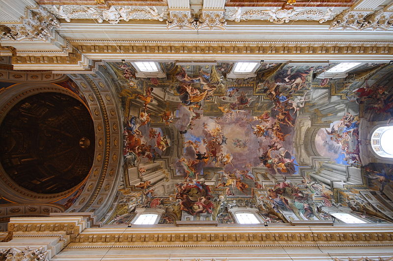
The art of trompe l'oeil dates back to Greek times, and figures among the Greek mythology:  "A legendary contest is remembered between two ancient Greek painters, Zeuxis and Parrhasius. They challenged each other to produce the most realistic painting. Zeuxis painted grapes which the birds flew down to try and eat. Then, Zeuxis asked Parrhasius to draw back the curtains on his painting. Parrhasius knew he had won because the drapes were part of the painting." - Rebecca Abel, Brown University. By far the most beautiful examples of this art are found in the churches of Rome. This exquisitely rendered ceiling of Sant Ignazio was painted by Andrea Pozzo around 1685. The ceiling is completely flat, including the dome. The effect in real life is indescribable - the figures above seem to bend toward you, and their expressions alter in the light.

St. Peter's Basilica and the Sistine Chapel are of course the most well known ceilings, but glorious examples are found throughout the Vatican. In this hallway, an unadorned ceiling appears to be intricately plastered and carved.

This tradition later made its way to America, quite literally in the case of the library at Biltmore, which was imported from an Italian Villa in strips and then reinstalled on the ceiling. Constantino Brumidi brought the ceiling mural to government; below, the interior of the U.S. Capitol dome, depicting the Apotheosis of Washington (surrounded here by some picturesque clouds and the original 13 colonies, represented as maidens). The square pattern around the mural is not trompe l'oeil (literally: "fool the eye"), but impressed steel, painted to compliment the mural. It too has an Italian model:  the Pantheon.

Trompe l'oeil is still alive and well today. Here's chalk artist Julian Beever's highly amusing street work - the sidewalk is still there, but notice how the pedestrians are skirting it anyway.

And if you're feeling VERY daring and want to pick up a brush yourself, try The Art of Faux
Credits: Sant Ignazio, Wikipedia. Vatican Hall, About.com. Capitol Ceiling, aoc.gov. Julian Beever's work, sharenator.com.

Sunday, June 28, 2009

Redesign: The Green and White Chinoiserie Desk

I have a quaint little fold-top desk that has been with me since childhood. A writer must have a desk, however small, and this one has followed me like a devoted little dog through a series of apartments and houses, frequently squeezed into awkward corners, dragged up stairs, or stuffed in the back of my SUV. My faithful desk needs a face lift, and I've decided to do it in green and white chinoiserie. 
It may look average now - but wait till we're through!

THE PROJECT
1. Replace the handles and knob with brushed brass bamboo hardware.
2. Decoupage the interior of the desktop in a green and white trellis paper.
3. Paint the foot and crown of the desk in a green matching the paper.
4. Fill it with beautiful things!

THE PIECES
A few favorite items I'd like to use in my re-design (clockwise):  
1. Thomas Paul crysanthymum pillow. 
2. Iomoi personalized paperweight. 
3. Brushed brass faux bamboo hardware. 
4. and 6. Iomoi pencils. 
5. Jasper Conran for Wedgwood china (for paper clips and odds and ends). 
6. Lucite green and white chinoiserie tray, by Iomoi. 
Green and White Chinoiserie

A Jonathan Adler chippendale style faux bamboo chair, accented with a Thomas Paul pillow. While I'm concentrating on renovating the desk right now, a new coordinating chair is in the future. I may get a green version instead of white - Adler makes both!
Bamboo Chair

A bamboo trellis pattern wallpaper I'm planning to order for the interior decoupage. I'd love to do Wearstler's Imperial Trellis (see below), but it's a bit pricy for an amateur project. I need an affordable paper available in less than a single roll, in a green and white trellis pattern. Do you have a great suggestion? Send it on!!!
THE RESULTS...  stay tuned! 

In the meantime, here's a little of my inspiration. ANY mention of chinoiserie can't overlook the stunning blog Chinoiserie Chic, the authority for this subject in the blogosphere. Check out Beth's recent post on the Blanc de Chine Office, as well as a detailed how-to on chinoiserie decoupage, with stunning results like this:
Maybe I should do filing cabinets next?

And while we're at it, here's an example of Kelly Wearstler's Imperial Trellis used in decoupage and the green Jonathan Adler chair. I'd already thought up this scheme when I stumbled on the picture, and it was nice to see how well it could come off. Here's hoping for a happy ending!

Movie Credits:  All "pieces" as listed above.  File Cabinet Photo, originally Domino via StyleCourtvia Chinoiserie Chic. Trellis Decoupage Cabinet Photo, an unknown, online find. If this is your picture, please email me so that I may give credit where credit is due!

Saturday, June 27, 2009

Hermès Style Pavilion

Because it's Saturday, 
because it's a pavilion, 
because everyone needs a little happy orange and white in their day!

P.S. It's on SALE.
Pavilion for sale at zgallerie.com

Thursday, June 25, 2009

Lauder Beauty

Design beauty, that is. I was so inspired when I saw the latest issue of Elle Decor featuring Aerin Lauder's East Coast homes. Often when paging through magazines I see bits here or there to take away, but every now and then a home really resonates with me. There's a lot here I wouldn't hesitate to do.

Blue and white is so common and yet so powerful.The mixture of brown/white and blue/white here brings a high society look back to nature. The wall vases are antique delft.

Does this remind anyone else of Sister Parish's White House bedroom design for Jackie Kennedy? I think it's the shade of blue, tall window treatments, and gilt - not identical by any means, but the feel is very similar.

A boy's room - and it's NOT in blue! This is a fresh, citrusy look, but it's still male. The subtle jungle elements in the wallpaper are well accented by the stuffed menagerie. My only hesitation? Such a lot of white on that bedspread - I feel sticky fingers in the future...

All images, Elle Decor Magazine. 

Copycats?

I was browsing the Target website the other day and noticed this bag. Look familiar?

It should. It's a very close replica of a COACH classic gallery tote (see below). I couldn't find an image of it, but I recall this particular style also came in green - though not the putrid shade above. As copies go, I thought this one is pretty blatant. You can't tell in this image, but some of the COACH gallery totes have a double bib, as pictured above. Notice the curved feet insets, handles, overall shape and similar hardware.
Copyright issues are very complex, because the line between a copy and an inspiration (and who did what first) can be very subjective. For me, this looks more like a copy.

HOWEVER...

Gucci Tattoo Collection, Fall 2008


COACH Tattoo Collection, Spring 2009


I think that this is a horse of a different color; the IDEA is the same (tattoos), but the execution is different. Similar? Yes. The same? No. But then again, it's purely subjective. What do you think? Is it copying or inspiration?

Bag 1: Target. Bag 2: COACH. Bags 3 &4: Gucci. Bags 5&6: COACH.

Wednesday, June 24, 2009

The Coral Desk

I haven't posted on coral in a little while, and lest everyone think I'm slipping, here's a fresh dose. In the Summer spirit, I'm loving the idea of a matching desk set in coral branch patterns of orange and blue. My inspiration for this color combination is blogging friend Anne Harwell, of Annechovie, and her wonderful depiction of an antique French chair, available on Etsy. Anne is a gifted artist and does beautiful prints of homes and objets d'art. 

It's unfortunate that often we spend so much of our lives in the office, and so little thought on how that space affects us. Wonderful store, Iomoi, has the most beautiful office accessories (my thanks to Beth at Chinoiserie Chic for bringing Iomoi to my attention!).

Iomoi Shipping Labels

Business Cards

A Stylish Lucite Tray

A Personalized Paperweight

Stationary

And a Thomas Paul floor rug - just the thing to tie it all together!
Credits:  Chair artwork, courtesy of Anne Harwell. Office products, Iomoi. Rug, Thomas Paul.

Victor, Victoria Magazine!

Victoria was the beginning of my love affair with magazines. I stumbled upon it at a grocery check-out at the astute age of 12, mistakenly assuming it was about the Victorian world of my period doll, Samantha. It was a fortuitous mistake. The Victoria of the early 90s was a glossy, richly filled publication; every page was layered in gorgeous photography. Fashion inserts featured couture styling, luscious velvets, and a great deal of jewelry. I learned good aesthetic principles from those pages, thick with creative decorating, history, gardening, and excellent writing. I eventually began to read other magazines - Architectural Digest, House Beautiful, Vogue, and Town and Country, but I never threw away a Victoria. When I returned to the U.S. in 2003 to find that the magazine was no longer on the shelves, it was a real blow. Hoffman publications brought back Victoria in 2007, and I wondered if they could really capture the unrivaled combination of good taste and graceful living that made the original magazine so unique. They could. The latest July/Aug issue not only features Draper's freshened up Greenbrier, but the restored rooms of Edith Wharton's The Mount. Don't miss this issue!!!

THE GREENBRIER
The graceful Greenbrier. Originally founded in 1778, the 721 room hotel within a few hour's drive of D.C. has hosted most U.S. Presidents and numerous other dignitaries. When Draper first encountered the Greenbrier, it was in dilapidated condition, having served as an army hospital during WWII. She roamed the halls with a flashlight, planning the rooms for which she would become famous. She claimed to have encountered the ghost of another guest, Robert E. Lee, in a corridor. 

The entry staircase Draper made famous. Her philosophy about pattern was "more is more."

A room vinegette, with more layered pattern and the fearless use of color that characterizes much of Draper's work.

Ancient influence is felt throughout the Greenbrier. Draper interspersed busts and statuary with bold modern design. 

EDITH WHARTON'S THE MOUNT
Edith Wharton's beautiful home. The author of what many consider the first book on interior design, "The Decoration of Houses," designed the 1902 estate herself. Edith's inspiration was the English country home, Belton House.

While architects Ogden Codman (with whom she co-authored "Houses") and Francis Hoppin finalized the plans for the house, the garden design was all Edith's own.

Edith Wharton stuck to her decorating principles; the guidelines she gave in "The Decoration of Houses" were followed religiously at The Mount, to marvelous affect. Wharton's goal was to revive house decoration as a branch of architecture, holding that a room with lovely furnishings and poor design could never achieve true beauty. She preferred exquisitely detailed design with simple furnishings and colors. In this space at The Mount, the architecture of the room is indeed on display, while quiet details and soft colors bring harmony to the space.

Images, Victoria Magazine. Exterior view of The Mount, edithwharton.org. These pictures are not featured in the magazine story; check out the newsstand for the full scoop.

Tuesday, June 23, 2009

Team Player

Earlier this week, I wrote a little about my obsession with clutches (and my inability to get much use out of them). But, bless the blogosphere, I'm in good company. So when I found Isabella Dean's personalized clutches, I had to share - mostly in the hopes that I won't be alone in mortgaging my dollhouse for yet another handbag.

Isabella describes her charming designs, made from old t-shirts and jeans, as "up-cycling." A dream gift for all those girls out there who are as passionate about sports as their boys - they just want to cheer stylishly. What team will you carry?


All images, Isabella Dean.

Monday, June 22, 2009

Stately Oaks Plantation

A while ago I visited Stately Oaks Plantation in Jonesboro, GA, just south of Atlanta. The house and grounds are in beautiful condition. All the buildings are historic, though this wasn't their original location; the big house, cabins, an indian camp, and a general store were relocated here. Part of Jonesboro's claim to fame is as the setting of Gone With The Wind...

"Rhett, I'm home!"

A bit more modest than Tara, but then, Hollywood DOES exaggerate.

Fell in love with this dining room. It's decorated to period, but reminds me strongly of Monet's rooms at Giverny. Notice the little object hanging in the right window? It's a fly catcher - a little blue and white porcelain jug, with holes around the side and molasses on the bottom. Life was much harder before modern conveniences, but that didn't prevent determined taste-makers from leading beautiful lives.

Monet's dining room. Another wonderful example of sunny yellow and bright blues. VERY yellow in fact!

This last (far more humble) building is the kitchen. Kitchens during this period had such a nefarious habit of burning down, they were kept as far away from the house as possible.  I share the same sentiments today - but only because I hate cooking!
Images: Stately Oaks, my own. Monet's dining room, www.galenfrysinger.com